Friday 19 April 2013
This will be our final piece for our coursework as the deadline is today. We are happy with the out come. We added into our sequence each of us presenting our powers in a different way, this was very difficult as we did not have the easiest of powers. However myself and Hayley filmed the powers for Air Girl, Fire Girl and Giggle Girl as Bobbie could not film hers. Holly went to her own house and filmed her power on her own. During school we managed to cut and edit our sequence so it was completed for the deadline.
Friday 12 April 2013
Final Evaluation
I have answered all of the questions that were put in place to help me with my evaluation, here is the finished evaluation within a Prezi Powerpoint. Enjoy.
Breif description.
PART 1 of Evaluation
Rest of the last question-
We listened to the feedback given and also took our time to evaluate and take on board what had been said. To me this has been a lesson that has been learnt and if I was to re do this media product again I would leave myself more time to complete things. I have also learnt from the process of my preliminary task that I should involve myself more and get my views listened too as some of the time the others agreed, despite being assigned roles I felt that I would have liked to have put more input to some of our other tasks and put my ideas out there. My role was the makeup and locations and I felt this was best for me because I like to design things and be able to find the right locations for certain clips. We all had some input to each other’s roles within the group and by the end I think we all decided just to go along and help each other out as we needed to complete this within a short amount of time
Changes due to feedback
We have recently recieved feedback from our teachers and below are some of the changes that are due to be made:
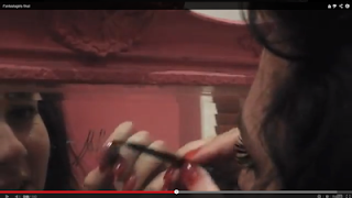
In this shot, we decided that I should laugh as I write my name onto the mirror because my power was 'laughing', however this came across to the audience that i was immature and I could not be serious in front of a camera, which is the total opposite to what we tried to achieve with this shot. I felt quite annoyed because of this, purely because the power laughing is difficult to get across without it coming out immature, however I listened to my teachers and came to the decision that if I wanted a better grade I would have to put different ideas into the title sequence.
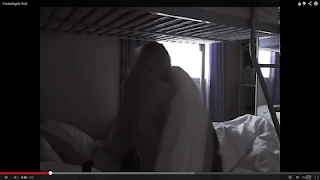
This was also a bad shot due to the lighting, despite the shot being done so it looks like the morning, it is far too dark and we will have to re shoot this because the other shots of us in bed are quite light and it looks out of place.
I also feel this shot needs to be changed due to the darkness of the top two screenshots against the bottom. Although these were the newest shots we filmed, if we wish to get a better grade we will have to adjust either the lighting or re shoot the whole scene again.
We was told that our title sequenced dropped grades due to it being too short, to over come this we have decided we will add even more shots of the Fantastagirls getting ready, but also make our powers look more like a superhero power rather than just 4 teenagers getting ready.
We also need to re do our story boards as we have re shooted/changed ideas so much over the course of our time to do this task.

In this shot, we decided that I should laugh as I write my name onto the mirror because my power was 'laughing', however this came across to the audience that i was immature and I could not be serious in front of a camera, which is the total opposite to what we tried to achieve with this shot. I felt quite annoyed because of this, purely because the power laughing is difficult to get across without it coming out immature, however I listened to my teachers and came to the decision that if I wanted a better grade I would have to put different ideas into the title sequence.

This was also a bad shot due to the lighting, despite the shot being done so it looks like the morning, it is far too dark and we will have to re shoot this because the other shots of us in bed are quite light and it looks out of place.

I also feel this shot needs to be changed due to the darkness of the top two screenshots against the bottom. Although these were the newest shots we filmed, if we wish to get a better grade we will have to adjust either the lighting or re shoot the whole scene again.
We was told that our title sequenced dropped grades due to it being too short, to over come this we have decided we will add even more shots of the Fantastagirls getting ready, but also make our powers look more like a superhero power rather than just 4 teenagers getting ready.
We also need to re do our story boards as we have re shooted/changed ideas so much over the course of our time to do this task.


Sunday 24 March 2013
First attempt at the evaluation
Brief description
Our task to complete was to research and produce a title
sequence based on a specific genre in which includes typical and none typical
codes and conventions for a new film. The genre we challenged ourselves with
was ‘superheroes’; we decided on this genre as it was unique and no one else
had come across this type of genre within the class. Our title sequence
consisted of the characters, played by my group and I, getting ready in the
mornings while in separate houses and then meeting up to show us as we join
together to form a new superhero group, despite starting out as individuals.
Throughout our title sequence we decided it was best to hide our identities as we
did not want to reveal too much until the very end. Within our title sequence
the characters; Bubble girl, Air girl, Giggle girl and Fire girl all had done
certain routines that fitted their characters. For example, we had Fire girl
whose name appeared in burnt toast, this gave the effect that the characters
powers were of course Fire. We had Giggle girl laughing into a mirror because
she smudged her eyeliner and then her name was written onto the same mirror.
Also Air girls name appeared within the bathroom steam from the bath, we felt
this was suitable to her name as her name was displayed into the steam. Lastly
we had Bubble girl blowing a bubble before leaving the house and her name
appeared and then bounced off the screen to match her name. We chose to name
our title sequence ‘ The Fantastagirls ‘ because it seemed more aimed to the
audience of girls of a younger age, and this is what we wanted to achieve.
Our media product challenged the ‘superhero’ stereotype by
changing it to a female role instead of the typical male hero. We felt that by
doing this we could knock the typical stereotype, despite this being for young
girls. Due to research and planning before hand, we all decided that our
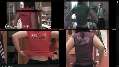
superheroes needed more of a superhero look; therefore we designed our own
t-shirts that had our character names designed in unique writing. During our
final shot of the ‘ Fantastagirls ‘ together we had a low angle shot to show
the superheroes as superior to ordinary people. As we have seen in films such
as Sky High and The Incredibles, we found that their front covers of DVD’s and
film posters that they are also captured from a low angle. We wanted to keep
our music upbeat, but also still aimed at girls, as this was our target
audience, I felt like our music was in time with the cuts of our shots that we
filmed of us getting ready. As superheroes are stereotypically always on the
move and helping people out we have sped up our shots and this gives the
audience a feel that the individuals are off to ‘save the day ‘.
Our scenes we decided to film in, consisted of our houses,
bedrooms, bathrooms and kitchens as that was what we was trying to give away,
the fact that we all lived ordinary lives before going out an fighting crimes.
We tried to keep the settings as natural as possible as our film was based on
normal teenagers that found they had these powers and decided to join together
to be more powerful. We decided to film in the Abbey ruins as they were quiet
and obviously superheroes keep a low profile and hide their identities.
We have had a lot of problems along the way, regarding our
filming and our plot. This was our second idea as we found our first did not
meet the correct forms and conventions of our genre and that we didn’t
challenge them as well as what we could have, regarding our abilities to do so.
After a long discussion with the rest of the group and our teacher we came to
the decision to base our title sequence around the ‘ Fantastagirls’ and we are
now very pleased we did so, because now the clips and the finished product
resemble that of real media products such as the films spoken about briefly
before.
How does your media product
represent particular social groups?
Our media product represents the social groups of young
girls, as this is our target audience. The social groups that watch our title
sequence will pick up on the things our characters do, for instance, getting
ready in the mornings, making their own breakfast and being able to do things
for their selves. We would like our characters to be a type of role model
towards our target audience. Since the characters used in our title sequence
are known TV stars of their age groups. As a girl myself I always looked up to
certain actors and girls of a similar age and I think from my own experience
girls would look up to these type of females and maybe ‘ copy ‘ their actions
that are portrayed within our sequence.
What kind of media institution might
distribute your product and why?
During other discussions we felt it was best for
Walt Disney to distribute our product based on their films and TV shows that
have been brought out in the past. Walt Disney produced films that we
researched into such as ‘ Sky High’ and since that film has had viewings from
young audiences we felt that would be best, not only that, the film is also
based on young superheroes. We liked the idea of having our target audience
wanting to watch our media product because of our characters as they like to
watch their favourite TV stars in other Disney shows. This is why we felt that
Walt Disney would be the best media institution to distribute our product.
Who would be the audience for your
media product?
We
addressed our audience through the title sequence as we felt they could almost
put their selves in the superheroes shoes as we displayed the characters as
normal people until the very end. The targeted audience could almost look up to
these characters. The characters we used to play these roles were those of the
ages of our target audience , for example the TV programs aired on Disney and
Nickelodeon, had the same characters we decided to use to play our characters.
We decided this because we felt that the target audience would want to watch
our film ( if we was to film the whole thing) due to the characters shown
within our title sequence. Also we found
that the target audience enjoyed other films such as The Avengers and The
Incredibles, so we based similar thoughts on those types of films.
What have you learnt about technologies
from the process of constructing this product?
During the editing of our title
sequence, that was edited on final cut pro, I found out a lot of things I
didn’t know before, however, I did find it very frustrating at first regarding
trying to remember how to put our own font into the title sequence, despite
over coming this problem that I had I could probably do with looking more into
it so I could make it clearer for myself. Also within final cut pro we found
the clip of Giggle girl turning up the radio very difficult as we had to try
and turn the backing track up in time with me turning the radio up, we decided
it was best to play around with different settings and try to lower certain
tones and increase others, while doing this and experimenting we managed to get
this sorted. I learnt that to get the clips and music in time with each other I
had to change the speed of either the music or the clips and although I had a
lot of fun while doing this it was also very stressful trying to get it in time
with each other, this was one of the things that our feedback included from our
class, that some of our clips have been out of time, so we edited more of our
clips into the title sequence and have now completed what we aimed to do and
hopefully this is now up to the correct standard of our class feedback but also
with our target audience in mind.
Looking back at your preliminary task,
what do you feel you have learnt in the progression from it to the full
product?
As an individual I feel I have
learnt skills to do with photo shop that maybe I wasn’t strong enough on at
GCSE and also final cut pro has been the main program used within our title
sequence. I feel that I have learned new skills that I wasn’t fully aware that
could be used. However, my group and I had to overcome a lot of difficulties
regarding the time split between us, and the roles within the group, we found
it difficult to find days where we all had the time and that did cause a few
problems, despite that we did overcome them and managed to work around the
problems caused. Also we have re shot footage at different locations countless
of times. We decided half way through that we didn’t like our original plan and
that we should come to a group decision to make changes, also this caused
problems because we all wanted our ideas heard and some didn’t like what the
others did. I feel my group and I have come a long way and I am extremely
pleased that we have managed to put our difference aside to complete the media
product. We listened to the feedback given and also took our time to evaluate
and take on board what had been said. To me this has been a lesson that has
been learnt and if I was to re do this media product again I would leave myself
more time to complete things. I have also learnt from the process of my preliminary task that I should involve myself more and get my views listened
too as some of the time the others agreed, despite being assigned roles I felt
that I would have liked to have put more input to some of our other tasks and
put my ideas out there. My role was the makeup and locations and I felt this
was best for me because I like to design things and be able to find the right
locations for certain clips. We all had some input to each other’s roles within
the group and by the end I think we all decided just to go along and help each
other out as we needed to complete this within a short amount of time.
Tuesday 5 March 2013


Tuesday 5 February 2013
Editing

This was the start of our editing, we had lots of shots to choose from so we had to choose the ones with the best camera positions and the ones that suited the filming the best.
This shot of Bobbie walking will have to be edited to a jump cut because we sped it up and it didn't look right, so we will continue working on our editing.
Thursday 31 January 2013
DIARY- 31st January
DEADLINE DAY
Just our luck, everything goes wrong when we are trying to edit.
We have had problems with the format of our footage because the format is in a format that the macs cannot read, so we had to download a converter. The first time this happened we managed to get the files converted, so today we expected everything to go smoothly as we only have a few hours left.
We started up the macs to find that the converter was no longer on my mac, we then had it re downloaded and tried to convert the files, then we found out, half hour later that we was trying to put the wrong files in the converter, after experiencing that we got the files to work. Then the final cut pro began to crash and we all began stressing. I was on one computer converting while importing files to final cut pro and Hayley was on the other trying to receive the files, this managed to work until we noticed a chunk of the files was missing, so we had to go through the process again until we both had the correct files.
DIARY- 30th January


Today we filmed the last shots we needed to complete our title sequence, the outcome has been successful and we feel with the editing we will do tomorrow it will finally be completed.
Tuesday 29 January 2013
DIARY- 29th January
I feel me and my group have done exceptionally well despite implications along the way. By all of us putting in the effort and time to complete videoing and also spreading the editing out equally we will have something to show to our class on thursday as that is the showing of our title sequences. Even though we have not completed everything I feel that we have pulled our socks up and worked well.
Blooper videos
Today we also decided to make blooper videos of things that have possibly gone wrong, or things we found we wanted to change. We decided on doing this so you could see our progress and the ability to be able to make our title sequence a better grade.
We have edited the cut outs and various shots that are no longer needed or that have gone wrong and made two seperate videos.
One of which consits of the previous story board recordings that we filmed in Danson Park and during school, which we are no longer using because we felt it didnt fit what we was capiable of doing.
The second consisted of the new story boards that we have recently filmed, these are the correct videos although we had difficulties. So to show you how we over come them from our final product, we decided we should show you what went wrong.
DIARY- 29th January
Today we began editing our title sequence and this went very well, we are pleased with how our situation turned out as we have had to change a lot of our original plans. We have included the 'Working Title' logo and the clips we have into the sequence. The problems we faced was getting the shots to fit together smoothly and not have them jumping. We found the filming of me and the makeup was difficult to over come as we had to cut a lot because that shot was the most difficult.


Music choice
Recently we have changed our title sequence and have also decided to re do the music choice. It was decided that we should now have more of an up beat song that will show the audience the type of film we would have produced if this was our task. The type of music also shows that the title sequence is aimed at young girls. We have used the same website as before and now have our options open to which music will suit our title sequence
Typography

We have decided as a group to keep our typography the same through out our title sequence. I feel that this is the best type of typography for our target audience and also it fits in nicely with the story of our title sequence.


Monday 28 January 2013
Diary
Lately we've had a few problems based on our story boards and our story line. We have had countless discussions regarding this problem and have spoke to both Leanne and Shaun, during this we have made various changes to our title sequence and have decided to base the sequence more around the aim of the Fantastagirls instead of the Vilan 'Zorack'
DIARY- January 28th
Today we decided to film the first attempt of our new story boards as our original plan did not work as well as we expected. We have our shots of the Fantastagirls walking down the stairs, as individual shots.We have also completed our outfits as we felt our outfits before was not very superhero looking. We decided to have our names printed onto our backs to show the audience the main characters during the title sequence. We have now filmed us doing our daily routine and have snippets of our faces to give away parts of who we are. Throughout our filming things did go wrong, with me, the makeup shots we first planned did not work. We had to re think our shots and came to the decision that I should change how I do my makeup. Over all we are very pleased we have came to the decision of changing our sequence as we feel it has given us more of push to complete the sequence and to get better grades on this and our blog. I feel I am more happy to post successful blog posts to show our progress.
Thursday 24 January 2013
24th January- changing decisions
After speaking to various people and Leanne we have came to the decision to change our sequence to fit more around the Fantastagirls instead of the villain. After editing our first attempt we all felt like it was not at the best of our ability and we have decided to re shoot on Monday.
We have decided to include various shots of a daily routine to show us coming together. We have decided when to film this and have organized our time and have realised we need to put in a lot of effort to get this completed within the time given. so we hope that it will be more successful. The sequence includes each Fantastagirl walking down the stairs after waking up and getting ready without their whole image being shown. We will then have each person doing something associated with their power. For example, me (giggle girl) will be applying makeup which I will then make a mistake and this will lead to making me laugh and will have my name written into the mirror. Hayley (air girl), this includes her getting out of the shower which has been making the mirror steamy and then she will write her name in the steam to give of the affect of steam. Holly, (bubble girl) will be chewing her chewing gum, which will pop and we will edit to write her name. Bobbie, (fire girl) will be eating her breakfast, and her name will appear in the food, which we will shoot hot, and this will create steam, we hope to do this with spaghetti letters . Also in the shot of bobbie we will include a newspaper in the background while she is round the table. This will then lead on to them coming together.
We understand how much work will have to be out in to make this possible and we are prepared to put the effort into making this sequence work.
Thursday 17 January 2013
DIARY- January
Today we went to Danson park to film the Fantastagirls coming together. We have over 30 different shots. We had a shot of the Fantastagirls by the lake, and then at the end we have a jump cut shot of us all appearing next to the lake, just before that shot we have a shot of a person reading the Fantastagirls newspaper and then says ' its not real ' and puts the newspaper down onto the bench, we then had the camera pan to the jump cut shots.
We filmed the shots over again to make sure we had an option between each shot.
We also re filmed people on benches reading the Fantastagirls newspapers, we re filmed this because our last attempt was not very good as we panned back and forth and it became shaky and one continuos frame. We did not feel that was at the best we could have filmed so we re filmed it.
Tuesday 15 January 2013


Monday 14 January 2013
DIARY- January
Today we filmed shots of Zoracks dad that had recently saved the day and was being surrounded by fans and reporters waiting for him to explain what had happened that day. We filmed this shot several times in different angles to see what shot came out better. After shooting Zorack from the distance he was watching his dad become surrounded by people, this made him angry so we decided to film Zorack dropping his toy down at the floor upset that his dad is neglecting him.
In the filming we had trouble getting "reporters " for Zoracks dad as people are in lessons or revising after school. We still managed to get the shots we needed. If we was to re shoot we would have made it better planned
Thursday 10 January 2013
Saul Bass
Bass became widely known in the film industry after creating the title sequence for Otto Preminger's The Man with the Golden Arm (1955). The subject of the film was a jazz musician's struggle to overcome his heroin addiction, a taboo subject in the mid-1950s. Bass decided to create a controversial title sequence to match the film's controversial subject. He chose the arm as the central image, as the arm is a strong image relating to drug addiction. The titles featured an animated, white on black paper cut-out arm of a heroin addict. As he expected, it caused quite a sensation.

Saul Bass reinvented the movie title as an art form. By the end of his life, he had created over 50 title sequences for Preminger, Alfred Hitchcock, Stanley Kubrick, John Frankenheimer and Martin Scorsese. Although he later claimed that he found the Man with the Golden Arm sequence "
Saul Bass reinvented the movie title as an art form. By the end of his life, he had created over 50 title sequences for Preminger, Alfred Hitchcock, Stanley Kubrick, John Frankenheimer and Martin Scorsese. Although he later claimed that he found the Man with the Golden Arm sequence "
1920 Saul Bass is born in the Bronx district of New York
1936 Wins a scholarship to study at the Art Students' League in Manhattan
1938 Employed as an assistant in the art department of the New York office of Warner Bros
1944 Joins the Blaine Thompson Company, an advertising agency, and enrolls at Brooklyn College, where he is taught by the émigré Hungarian designer and design theorist Gyorgy Kepes
1946 Moves to Los Angeles to work as an art director at the advertising agency, Buchanan and Company
1952 Opens his own studio, named Saul Bass & Associates in 1955
1954 Designs his first title sequence for Otto Preminger’s Carmen Jones
1955 Creates titles for Robert Aldrich’s The Big Knife and Billy Wilder’s The Seven Year Itch. The animated sequence he devises for Preminger’s The Man with a Golden Arm causes a sensation
1956 Elaine Makatura joins the studio as an assistant
1957 Devises titles for Michael Anderson’s Around The World in 80 Days and Preminger’s Bonjour Tristesse
1958 Forges a new collaboration with Alfred Hitchcock by designing the titles for Vertigo. Works with the architects Buff, Straub & Hensman on the design of his home, Case Study House #20 in Altadena
1959 Creates the title sequences for Hitchcock’s North by Northwest and Preminger’s Anatomy of a Murder
1960 First title commission for Stanley Kubrick, Spartacus, and the last for Hitchcock, Psycho
1962 Devises titles for Edward Dmytryk’s Walk on the Wild Side and directs his first short film, Apples and Oranges. Marries Elaine Makatura
1963 Stanley Kramer commissions Bass to create titles for It’s A Mad, Mad, Mad, Mad World
1966 Directs the racing sequences and devises the titles for John Frankenheimer’s Grand Prix
1968 Wins an Oscar for the short film Why Man Creates and develops a corporate identity programme for the Bell System telephone company. Creates an installation for the Milan Triennale, which is cancelled after a student occupation
1973 Designs the corporate identity of United Airlines
1974 Directs his first feature film Phase IV
1980 Designs the poster for Stanley Kubrick’s The Shining and devises the corporate identity of the Minolta camera company
1984 Creates a poster for the Los Angeles Olympic Games
1987 James L. Brooks persuades Bass to return to title design by creating the opening sequence of Broadcast News
1990 Begins a long collaboration with Martin Scorsese by creating the titles for GoodFellas
1991 Devises the titles for Scorsese’s Cape Fear and a poster for the 63rd Academy Awards. Bass designs the Academy Awards poster for the next five years.
1993 Creates the title sequence for Scorsese’s The Age of Innocence and a poster for Steven Spielberg’s Schindler’s List
1995 Designs titles for Scorsese’s Casino
1996 Saul Bass dies in Los Angeles of non-Hodgkins lymphoma
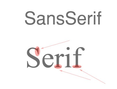
Two types
Serif is Sans serif with a flick type ends onto the bottom of the lettering which is used to make the font look more fancy and professional.
Our props

These are the other newspapers we have created. These again look better when blown up to A3. Each superwoman has a different section of the newspaper. This shows them fighting their own crimes individually before they join as one.
Our props
This is our first newspaper front page. We attempted to make them as realistic as we could. They looked like a real newspaper when they was printed out and blow up to A3 size.


Typography and Existing productions
Typography
These are often the order that the credits will run by.
We then looked at an existing production.
 Catch me if you
can
Catch me if you
can
These are often the order that the credits will run by.
- Name of studio
- Name of production company
- Producer name
- Staring (starting with the main actors)
- Featuring (featured actors)
- Casting director
- Composer of music
- production designer
- Editor
- Director of photography
- Producer
- Writers
- Director
We then looked at an existing production.

- Titles are integrated into sequence (become part of the action)
- Exit screen smoothly looks elegant and could resemble the character who plays the police officer.
- Typography looks stylised and works in sync with music.
- High production value
Font is sans serif
- 60's styled which hints time era of film/setting
- Informal font suggests film wont have a consistent serious tone and elements of humour could be present.
- Smaller words are serif which resembles an old typewriter which again references the 60's and suggests significance of the object in the film.
It is hard to discuinguish the Genre of this film because of the shapes that have been used. The typography is well used throughout, but would not be
suitable for our groups title sequence. The shapes used are similar to Saul
Bass' work with title sequence.
DIARY- january
January 10th
Today we filmed alot. We have nearly completed our filming and can then move on to the editing of the shots.
Today we filmed the four people sitting on the bench reading our newspapers and we got them in an over the shoudler shot. This worked well despite the weather conditions. We then filmed the girl holding the iphone in an office reading the same article about the 'Fantastagirls'.
So far we are pleased with the progress.
DIARY- december
December
We began filming our newspapers and this didnt go as well as we first thought it would do. The newspapers were too small so they didnt look like proper newspapers, we over come this by using the 'dolly' this made it easier to record the newspaper because we was able to move the camera around without it shaking, by over coming the size problem we decided just to focus on the titles of the newspaper and this was alot easier.
We began filming our newspapers and this didnt go as well as we first thought it would do. The newspapers were too small so they didnt look like proper newspapers, we over come this by using the 'dolly' this made it easier to record the newspaper because we was able to move the camera around without it shaking, by over coming the size problem we decided just to focus on the titles of the newspaper and this was alot easier.
Tuesday 11 December 2012
Roles in the group
There was four parts to decide who was who
- cinematography- Bobbie- directing- Hayley- design and props- Holly- location and makeup- Me
We have all been given roles within the group that we feel will fit us and what we can do.
- cinematography- Bobbie- directing- Hayley- design and props- Holly- location and makeup- Me
We have all been given roles within the group that we feel will fit us and what we can do.
I have been given location and makeup, We all decided that I would be best at doing this role because I like to experiment with makeup and I like to make certain decisions.
With locations I feel I could explain certain areas we could film in and that would fit our title sequence.
Monday 10 December 2012
DIARY- december
End of December.
During December we started making our props, the newspapers, these went very well and we are pleased with the finished product.
During December we started making our props, the newspapers, these went very well and we are pleased with the finished product.
Thursday 6 December 2012
Dawn of the dead analysis
Dawn of the
Dead title sequence analysis.
The genre of the film is constructed by the red writing that is
displayed in the beginning, when it changes to the next name, you find that the
writing smudges like blood; this then gives people the impression that the
genre of the film is horror/thriller because of the way the writing is set out.
The first shot of the person we see, it looks like someone has been hung, or
been tortured. This portrays that the film is going to be violent. This film touches upon the idea of Holy War as harbinger to the apocalypse. We are introduced to the cast names, to me the reason the names are placed in red and at the bottom of the screen because it indicates people dropping to the floor dying or keeping low to get out the sight of other people.
The music is quite fast; on the odd occasion you hear screams that
also gives the viewer an impression that this film is a thriller. As we get into the sequence and we see the
news reports the music becomes very country and western. Through out the
sequence you can hear people talking, often news reports on people dying or odd
occurrences that have been happening. Half way through the sequence a man
speaks out as if he is talking to a news reporter; he says, “there is no hope”.
This indicates people fear for their life. We hear the song in the background mention
that ‘ everybody is the same’ this indicates that people are not being picked on;
they are all being wiped out. The song
could also give people an insight on to how the viewer could be feeling through
out the film ‘ the hairs on your arms will stand up’. We also get the
impressions a lot of people have died because of this disease as we hear in the
song that the singer mentions ‘ 1 hundred million angels ‘. In the last scene
we hear a news reporter say ‘god there here’ and we get a close up from the
zombie and the shot goes black, so we don’t know what happens after, we are
left wondering how it ends and that draws people to get the attraction to watch
this film.
This film is associated with the war as we see a lot of soldiers
throughout the sequence. This isn’t just a one-city disease it is based worldwide;
we know this because the sequence is based on news reports from all over the
world, they want to warn people who don’t know what’s happening. We get all
source of our information from the news and information from other people, so
the sequence being based on different news reports show that this could be
serious. We get a close up of a man who behind him has ‘disease prevention’,
and all he keeps mentioning is that he ‘doesn’t know’ how to prevent this
happening, this gives people a worry because he is supposed to be able to help
others and stop this happening, but he doesn’t know if he can. We get the sense of religion, because of the
first image we are shown shows people bowing down, we also see people helping
each other even though they are trying to save their own life, this could also back
up that religion could be a part of the film.
This film has Women, Men from young to old, and also children, this
shows the viewer that what is happening in this film is affecting everybody.
Through out this sequence we see people being violent and fighting and running
away trying to flee their country. This
disease that is being spread has come from blood cells and blood from
‘zombies’, we know this because we are constantly being shown images of blood
and blood cells. We are also being shown
to Zombies covered in blood and seeing blood dripping from various scenes. The
viewer gets exposed to offices that have been fled from because they wish to
get away from this disease.
The viewers will become instantly drawn to the film because they wish
to know how or why this has happened. We see a scene of the president and the
white house being invaded, they have men trying to protect both the president
and the woman in the shot.
Friday 30 November 2012
Thursday 29 November 2012
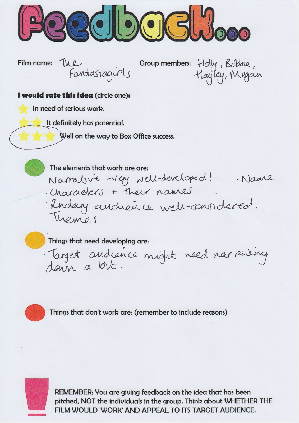
Our pitch for Fantastagirls
Our group pitch went well as the class understood as we can see from the feedback on my other post. We included: genre, narrative, target audience, characters, details on the character Zorack, the budget, underlying messages and the director, although the director has now been changed as we decided he wasn't suited for our film. We have listened to the class and decided we should make slight changes, which was the target audience. We are going to make our main target audience for a younger group, and we are then going to have a secondary audience which will be for a older group.
Continuity Sequence
I was pleased with our continuity sequence over all, despite not being in when this was filmed, although I did complete my own edit on Final cut pro. I feel like the swearing maybe ruined this sequence because I had to beep quite a lot of it out and I feel that this has had an affect on the final outcome, so if I was to redo this sequence I would definitely cut that out. The background sounds fit in really well i thought, although when the noise of the door shuts, it doesn't fully shut , where as the next scene the door is closed, so I feel the filming of that scene perhaps could have been re done. Also I think i edited it too short when Aaron puts his hand on the chair but doesn't pull it out and the next scene is of him sitting down. Over all we kept to the 180 degree shots and used different close ups and also different angle shots.
Thursday 22 November 2012


Blog feedback
In my blog feedback I took into consideration what was needed to be improved and I feel I have worked hard to complete the specific tasks spoken about. Lately I have been updating my blog to get it to the standard it needs to be at.
Wednesday 14 November 2012
Article
-'typography that seeks to match letterforms with the subject matter and even the zeitgeist — including typefaces inspired by art movements such as art nouveau, art deco and expressionism — as well as the commercial vocabulary of packaging design and advertising'
To me this expression it's completely true, the typography in a film gives the audience an insight of the film and also gives away the genre by the way the lettering is presented.
To me this expression it's completely true, the typography in a film gives the audience an insight of the film and also gives away the genre by the way the lettering is presented.
-'As movies grew more popular, their titles evolved. Movie producers invested considerable sums in film production'
I chose this because back in the day they had very simple title sequences, by this I mean they would be various shapes and colours with the characters and directors names, where as now they have different effects and clips from the film that helps promote the film they are watching the title sequence for.
-'As much as possible, they liked to convey the tone of a movie through the “dressage” of its main title'
I like this quote in the article because I believe that the main title gives the film it's audience, people who wish to see a film will often judge it on their first impressions and that comes under the title name and the way the title presents the film.
-'It could be argued that typography lost importance in this era of title design. The imagery behind the credits received a lot more attention'
I chose this because I didn't realise this until I finished reading this article, I think this is interesting because a lot of people see a film for its title, but the imagery is very important in a film as well, this also gives away the genre and an in sight into the film. The imagery also draws the audience to see the film as they wish to find out later in who that person or what the image is of and how it ties in with the story line and the selected title.
-'As designers have always known, the opening moments can make a deeply satisfying contribution to any film.'
I like this because I also believe that the very first impression for anything should be enough for the audience to wish to see that film, the opening moments are what bring people to want to carry on watching the chosen film. Viewers won't wish to see a film if the opening moments are some what boring or not up to the standards of they first thought.
Subscribe to:
Posts (Atom)